
How To Use Colors In Your Portraits
Portrait photography is all about people. How to shoot the best side of them is a big challenge. You need to interact with your model and lead them to pose.
You have to know it all to master portraiture. This is the below tips are all about. I hope you can get ideas from it.
1:simplfy the image
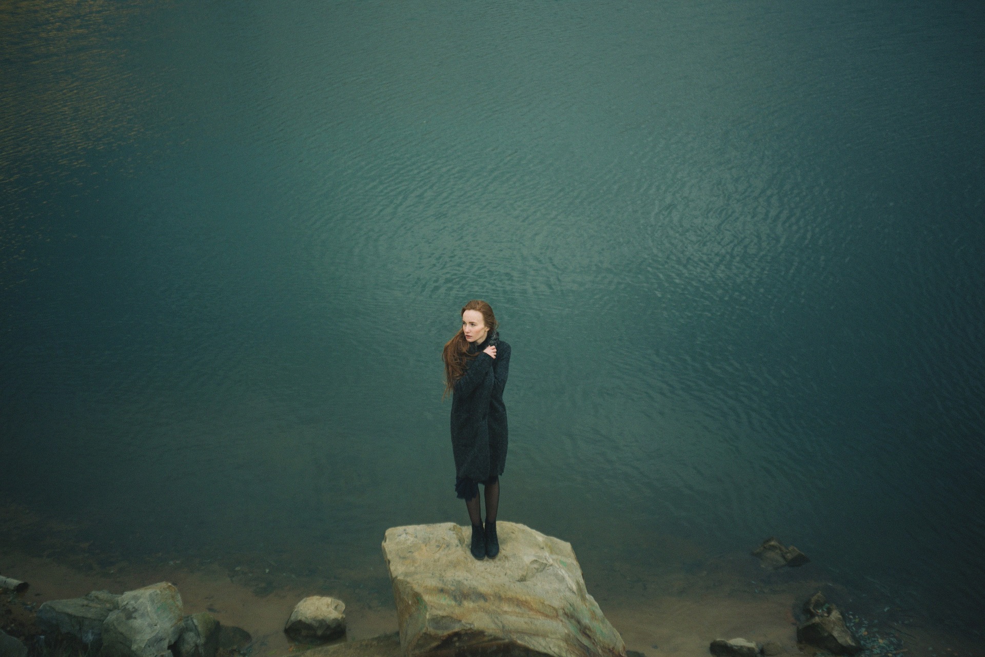
Too many colors can distract the viewer's attention. That’s why minimalist photography could directly attract the viewer’s attention.
To draw the viewer’s attention in a short time, we should avoid complex color combinations.
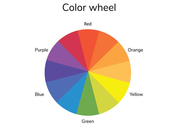
2:Use color wheel
The color wheel is an effective tool to understand color. We can quickly see what is the similar color and what is complementary color.
Using a similar color to create an image like the candy color tone combining a similar subject with the main subject. the complementary color will create a powerful contrast to the picture. It conveys more power and feeling.
3:Use the color to stir the emotion
Except for the color theory, color phycology is also a need for us to learn. You can use color to express emotion which can be easily changed in the studio. In the night light situation, we can adjust the white balance to change the image tone to get different emotions. For example, Soft pick tone will make the image look subtle, while the bright or high saturation color can convey the power and controls. Deep colors like the black blue, purple are related to something mystery or elegant.
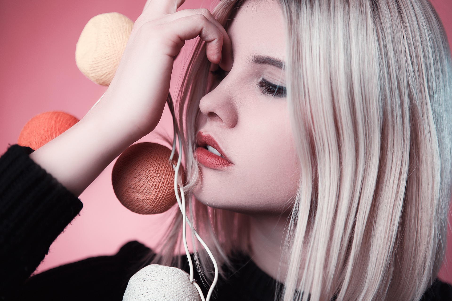
Color can also convey the mood, we know the blue means sad or red means dangerous or exciting, etc.

4:Use color to compose
Color plays a large role in composition also.
Relatively speaking, warm color (red orange yellow, etc) is easily the main element of the image while the cold color(blue, green)is more easily be the backdrop of the image.
In the neutral background,2 models standing together, one in red and one in blue, viewers tend to pay more attention to the one in red. 


 Variable ND Filter Neutral Density Filter for Camera Lens Ultra-Slim, Multi Coated")


